How to Improve Your Website Speed and Boost SEO Using Waterfall Charts
In today’s fast-paced digital world, website performance is no longer a luxury; it’s a necessity. Slow-loading websites frustrate users, increase bounce rates, and ultimately damage your brand’s reputation. But identifying the root causes of performance issues can be a daunting task.
Enter waterfall charts, your key to unlocking website performance optimization. These visual timelines provide a detailed breakdown of each resource’s loading process, revealing the bottlenecks that are holding your website back.
With waterfall charts, you gain a clear understanding of where your website’s performance is suffering. You can pinpoint the specific elements that are causing delays, whether it’s oversized images, inefficient code, or slow server response times.
In this blog post, I have employed GTmetrix and WebPageTest to illustrate the concept of waterfall charts, their metrics, and other important things such as color-coding scheme that you can use to interpret test results.
What are Waterfall Charts?
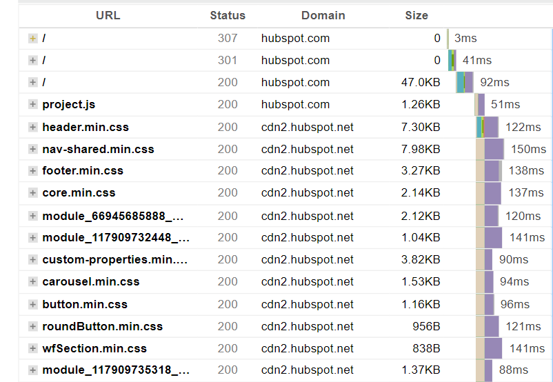
Waterfall charts are visual representations of the time it takes for each resource on a web page to load. They are generated by website performance testing tools such as GTmetrix and Pingdom. Waterfall charts display each resource as a horizontal bar, with the length of the bar representing the loading time. The bars are arranged chronologically, from top to bottom, showing the order in which the resources were loaded.
Why Optimizing for Speed is Important for User Experience and SEO
According to Google data, the likelihood of a mobile user prematurely exiting your website increases in proportion to the loading time. For instance, if your website takes around six seconds to load, the probability of a visitor leaving prematurely rises by 106% compared to the control group.
Understanding Waterfall Charts for Website Speed Optimization
Waterfall charts provide several insights into website performance:
Overall loading time
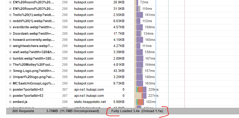
The total length of the waterfall chart represents the overall loading time of the page. A shorter waterfall chart indicates faster loading.
Resource loading times
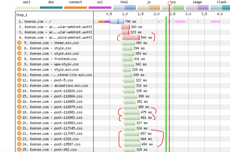
The length of each individual bar represents the loading time of the corresponding resource. Long bars indicate resources that are taking a long time to load, and these are the resources that should be prioritized for optimization.
Request order
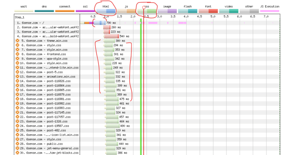
The order in which resources are loaded can also impact page load speed. In general, it is best to load critical resources, such as the HTML document and CSS files, as early as possible.
Interpreting GTmetrix Waterfall Charts for SEO
GTmetrix waterfall charts provide several key metrics that can be used to assess website speed for SEO:
First Contentful Paint
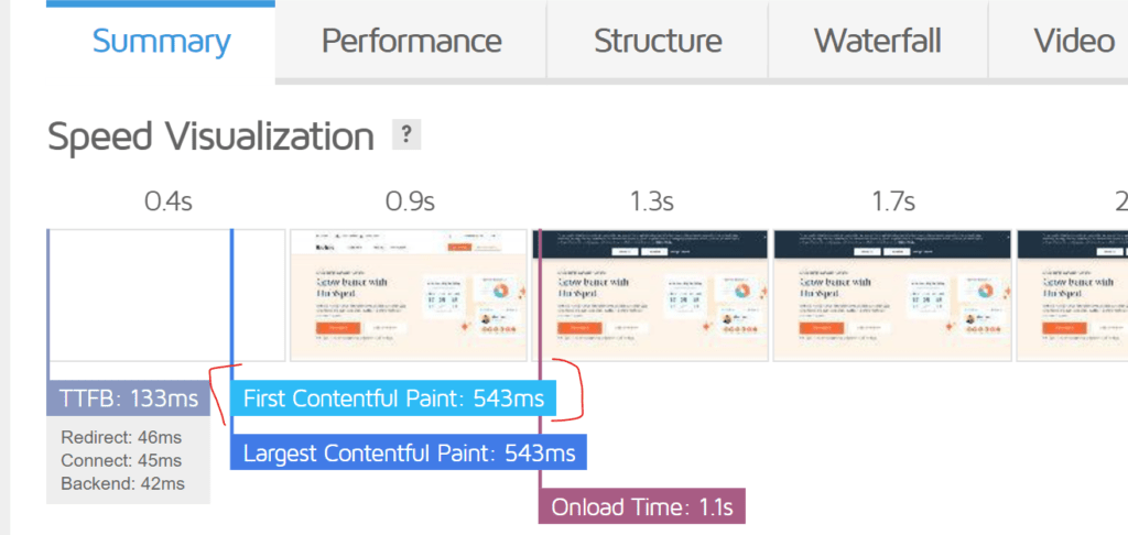
FCP measures how long it takes for the very first piece of meaningful content to appear on the page. This could be text, an image, or even a special drawing. Once that happens, you know that the page is actually loading and you can start interacting with it.So, think of FCP as the first sign of life on a web page. It’s the moment when the page stops being a blank canvas and starts showing you something that you can understand.
It’s like waiting for a new scene to load in a video game. The screen is blank, and you’re wondering how long it will take to see the actual content. This is where First Contentful Paint (FCP) comes in.
Time to Interactive

TTI measures how long it takes for a web page to become fully interactive. This means that all the elements on the page, such as buttons, links, and forms, are ready to respond to your clicks and inputs.
Think of TTI as the moment when the web page is fully “awake” and ready to serve you. It’s the point at which you can comfortably interact with the page without encountering any delays or unresponsive elements. So, while FCP marks the appearance of content, TTI signifies the point when the page is truly ready for user engagement.
It’s like you’re at a restaurant and you’ve just ordered your meal. You’re eagerly waiting to dig in, but the waiter hasn’t brought your food yet. This is similar to the concept of Time to Interactive (TTI) in web development.
Fully Loaded Time
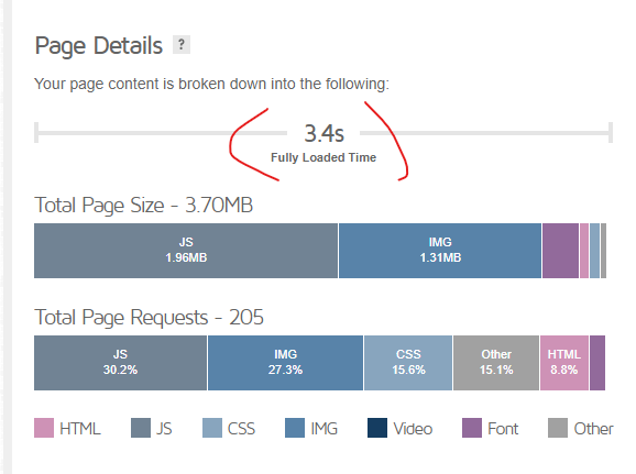
FLT measures how long it takes for a web page to completely finish loading all of its content, including images, videos, and scripts. It’s like reaching 100% on the download progress bar.
Think of FLT as the final milestone in the web page loading process. It signifies the point at which all the resources have been fetched, parsed, and rendered, and the page is completely ready for use.
So, while FCP and TTI focus on specific aspects of page readiness, FLT provides a comprehensive measure of the entire loading process, ensuring that the entire page is fully functional and ready for a seamless user experience.
It’s like you’re downloading a large file, like a movie or a software update. The progress bar slowly creeps along, and you can see how much of the file has been downloaded. This is similar to the concept of Fully Loaded Time (FLT) in web development.
Tips for Interpreting Waterfall Charts to Improve Website Speed and SEO
Size Matters: Small is Desirable
A long waterfall view may not always be bad, but it is generally better to have a shorter one. If your website has more than 100 requests, you should try to reduce the number to improve performance.
Total loading time
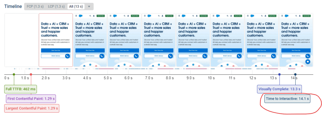
The total load time should be less than 10 seconds.
Perception over technicalities (Green and Red)
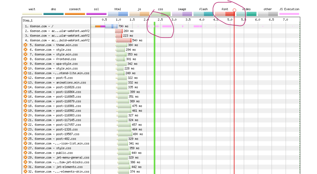
Website speed is often measured technically, but user perception is crucial. Webpagetest distinguishes between technical and perceived loading speeds. The green and red lines in Webpagetest’s waterfall chart represent perceived loading speed and should be close together. The green line should appear within 2-3 seconds, and the red line within 6 seconds.
HTTP/2 over HTTP/1 (green)
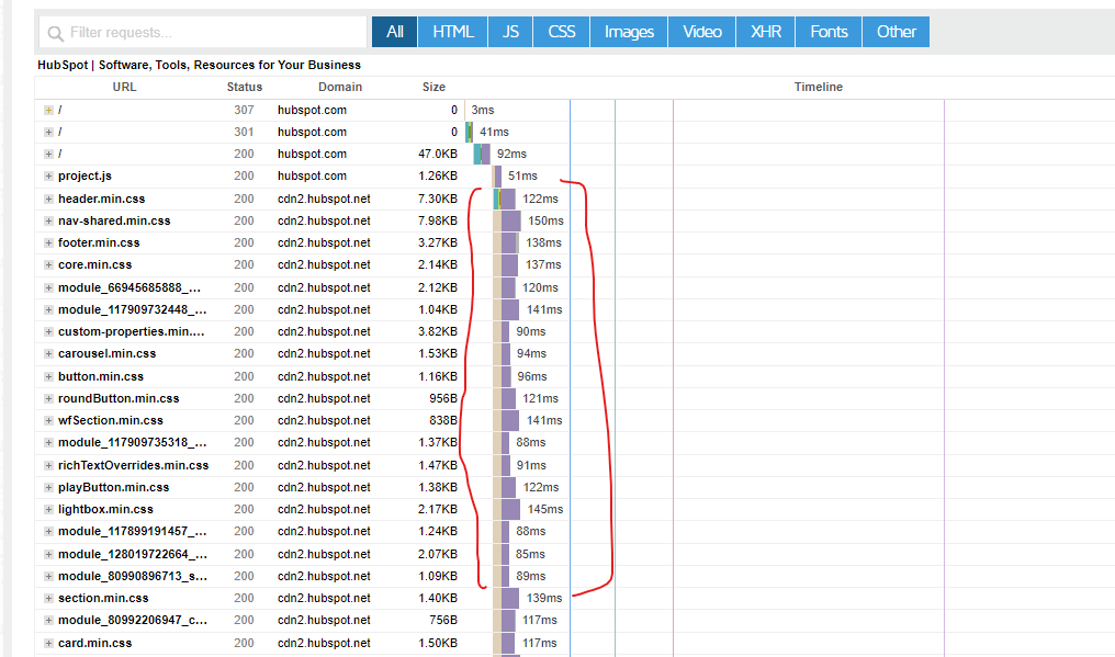
Websites load faster when using HTTP/2 instead of HTTP/1.1. HTTP/2 allows multiple resources to be loaded from the server simultaneously, which is visible in the waterfall view of a website. If consecutive requests are loaded in parallel, your website is using HTTP/2. If they are not, you should check with your hosting provider to see if they support HTTP/2.
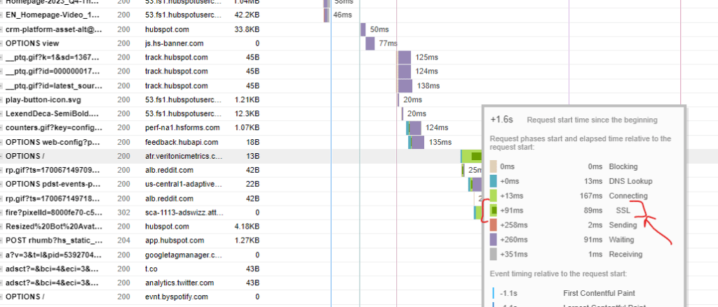
Tame the Image Beast (purple)
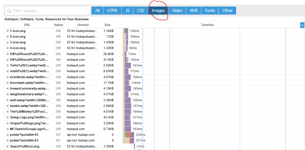
Images play a crucial role in website performance, especially after caching. WordPress creates multiple image versions, including featured images and thumbnails, for every uploaded image. Therefore, image compression is a powerful method to reduce website size.
Easily identifiable in waterfall charts, images are represented by violet bars in Webpagetest and icons in Pingdom. If these bars are significantly longer than other website requests, indicating slower loading times, it’s essential to optimize your images.
Unnecessary redirections (Yellow) are not cool
Redirects can slow down your website by adding extra steps to the loading process. Each time a visitor clicks on a link, their browser has to make an extra request to the server to find the correct page. This can add up, especially if there are multiple redirects on a page. Redirects to URLs on different domains can be especially slow, as the browser has to make a separate request to each domain. If you see a yellow row, it means there is a redirection. You should look into it to make sure it is necessary and not harmful
Proper rendering matters (Red)
A waterfall chart can be used to identify website components such as Google AdSense frame, an embedded map, or a font that are not rendered properly. Red rows in the chart indicate errors.
How Manmash Consulting Can Help?
Manmash Consulting specializes in helping businesses improve their website speed and overall user experience. One of the tools we use to achieve this is waterfall charts. Manmash Consulting can help you create and interpret waterfall charts to optimize your website speed and improve your bottom line. To contact Manzar Mashhood, CEO of Manmash Consulting, visit their contact us page or contact him on his Whatsapp number +923331200550.


